使用组件
我们提供了一些自定义组件,您可以在文档中使用。
要导入组件,请使用组件描述中的 import 语句。将 import 语句放在文档顶部,主标题之前,以及文档元数据之后。
---
...
hide_title: true
---

{/* PUT IMPORTS HERE */}

# The document heading
以下是我们的自定义组件列表。
Image
扩展图片组件。
导入
import Image from '@site-comps/Image';
| pub | src | (必需) 图片源,就像 <img> HTML 标签一样。 |
| pub | border | 是否在图片周围添加全页面宽度的边框(默认值:false) |
| pub | center | 是否居中图片 |
| pub | desc | 显示在图片下方的居中描述 |
| pub | minwidth | 一种方便的方式来指定图片的 minWidth。 |
| pub | width | 一种方便的方式来指定图片的 width。 |
| pub | maxwidth | 一种方便的方式来指定图片的 maxWidth。 |
| pub | minheight | 一种方便的方式来指定图片的 minHeight。 |
| pub | height | 一种方便的方式来指定图片的 height。 |
| pub | maxheight | 一种方便的方式来指定图片的 maxHeight。 |
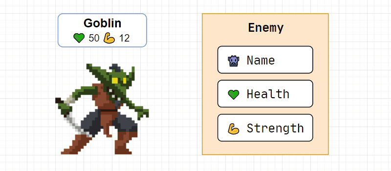
Image 组件示例
<Image center border
		maxheight={200}
		alt="Goblin enemy presentation"
		src="/img/tutorials/course/basic/structures/GoblinEnemy.gif"
		desc={<>Goblin image by <a href="https://luizmelo.itch.io/monsters-creatures-fantasy">LuizMelo</a></>}
	/>
结果
Columns
将子元素拆分为列。
导入
import Columns from '@site-comps/Columns';
| pub | columns | (必需) CSS 列宽(数组),参见下面的示例。 |
Columns 组件示例
<Columns columns={["8fr", "4fr"]}>
	<div>Contents of column 1</div>
	<div>Contents of column 2</div>
</Columns>
提示
Columns 组件通常用于并排显示代码及其结果。
您可以使用我放在 .vscode-template 中的预设“coderesult”代码片段。
已知问题
- 列宽不响应
CustomCodeBlock
为 Markdown 代码块添加附加功能。
导入
import CustomCodeBlock from '@site-comps/CustomCodeBlock';
| pub | maxLines | 超出此行数时,会出现垂直滚动条。 |
| pub | resizable | 用户是否应该能够调整代码块大小 |
更新日志
- 移除了
lineNumbers- Docusaurus 现在原生支持 Markdown 代码块中的showLineNumbers
已知问题
- 用户可以调整超出代码块高度的大小
GoogleSlides
嵌入 Google 幻灯片演示文稿。
导入
import GoogleSlides from '@site-comps/GoogleSlides';
| pub | src | (必需) Google 幻灯片演示文稿的源(在 /embed 之后截断) |
| pub | aspectRatio | 描述 width : height 比例的数字(默认值:16 / 9) |
| pub | delay | 自动幻灯片切换之间的间隔(毫秒) |
| pub | autoStart | 页面加载后是否开始演示文稿(默认值:true) |
| pub | loop | 是否循环演示文稿(默认值:true) |
| pub | fullWidth | 是使用页面宽度的 100% (true) 还是 80% (false)(默认值:false) |
示例
<GoogleSlides
		src="https://docs.google.com/presentation/d/e/2PACX-1vTsdQPMXKN90rcz4i515JK-rpUHjHTc5xIjGVtNJS8XSbloMNObHEBUSszvYi9I7tuKBNIdEKNFh1jk/embed"
		aspectRatio={960 / 500}
		delay={500}
		centered
	/>
结果
SymbolTable
用于记录符号和属性的表格。
导入
import SymbolTable, { Symbol } from '@site-comps/SymbolTable';
SymbolTable 字段
| pub | noTraits | 是否隐藏最左侧带有符号特性(const、static 等)的列 |
Symbol 字段
| pub | name | (必需) 符号的名称 |
| pub | desc | 符号的描述。您也可以将其指定为子元素 注意 由于 MDX 格式化器的规则,如果您想在 JSX 元素中使用 Markdown 元素,您必须删除缩进,否则它将被识别为代码块。 |
| pub | autoLink | 自动生成链接 |
| pub | link | 自定义链接 |
| pub | linkName | 当 autoLink=true 时使用的符合 URL 规范的名称 |
Symbol 特性字段:
| pub | pub | 为符号添加“public”特性 |
| pub | priv | 为符号添加“private”特性 |
| pub | 保护 | 为符号添加“protected”特性 |
| pub | volatile | 为符号添加“volatile”特性 |
| pub | const | 为符号添加“const”特性 |
| pub | constexpr | 为符号添加“constexpr”特性 |
| pub | virtual | 为符号添加“virtual”特性 |
| pub | static | 为符号添加“static”特性 |
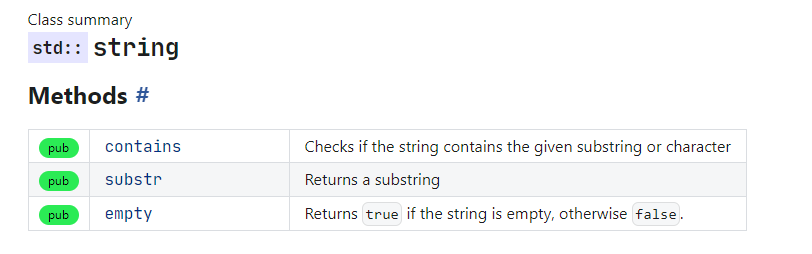
ClassSummary
导入
import ClassSummary from "@site-comps/ClassSummary";
用法
import ClassSummary				from '@site-comps/ClassSummary';
import SymbolTable, { Symbol }	from '@site-comps/SymbolTable';

<ClassSummary name="string" namespaces="std">

### Methods

<SymbolTable>
	<Symbol pub autoLink name="contains" desc="Checks if the string contains the given substring or character"/>
	<Symbol pub autoLink name="substr" desc="Returns a substring"/>
	<Symbol pub autoLink name="empty">
		Returns <code>true</code> if the string is empty, otherwise <code>false</code>.
	</Symbol>
</SymbolTable>

</ClassSummary>
结果
ClassSummary 字段
| pub | name | (必需) 类的名称 |
| pub | namespaces | 一个字符串,或一个命名空间列表,例如namespaces="std" 或 namespaces={["std", "chrono"]} |
ProductCard
导入
import ProductCard from '@site-comps/ProductCard';
用法
<ProductCard title="Visual Studio Code" author="Microsoft" img="/img/icons/products/vscode_1_35.svg" rating={9}>
	<ProductCard.Desc>
		A powerful tool with everything you need, including a code editor
		and a compiler that supports the latest C++20 standard.
		<ProductCard.Details>
			<h3>Pros</h3>
			<ul>
				<li>All in one</li>
				<li>Simple installation and configuration</li>
				<li>Access to the latest C++20 standard</li>
				<li>The best debugger available</li>
			</ul>
			<h3>Cons</h3>
			<ul>
				<li>Relatively big installation size (download ~2 GB, after installation ~7 GB)</li>
				<li>Not portable</li>
				<li>Windows only</li>
			</ul>
		</ProductCard.Details>
	</ProductCard.Desc>
	<ProductCard.Actions>
		<a href="https://vscode.js.cn">Product website</a>
	</ProductCard.Actions>
</ProductCard>
结果
Visual Studio Code
功能强大的工具,拥有您所需的一切,包括支持最新 C++20 标准的代码编辑器和编译器。
详情
优点
- 一体化
- 安装和配置简单
- 支持最新的 C++20 标准
- 提供最佳调试器
缺点
- 安装包相对较大(下载约 2 GB,安装后约 7 GB)
- 不可移植
- 仅限 Windows
ProductCard 字段
| pub | title | (必需) 类的名称 |
| pub | img | (必需) 包含图片 URL 的字符串,或 SVG 元素 |
| pub | author | 产品的作者 |
| pub | rating | 产品的评分,用 5 星显示。使用 0 到 10 之间的值。 |
ProductCard.Desc
它是 ProductCard 的子组件,用于添加产品描述。
ProductCard.Actions
它是 ProductCard 的子组件,用于为产品添加操作内容。
ProductCard.Details
它是 ProductCard 的子组件,用于为产品描述添加详细信息。
注意
ProductCard.Details 仅允许在 ProductCard.Desc 元素内部使用。
ToolCard
导入
import ToolCard from '@site-comps/ToolsSummary';
注意
TODO: 描述